24 years of logo evolution, from 1999 to present day in five steps
tictoc was formed on the 1st of September 1999, 8764 days ago, or 23 years, 11 months and 29 days from when this article was published.
Throughout the years, the company has gone through various transformations, and it's no surprise that our branding and corporate identity have also evolved with the times. As we move into our 25th year we felt it was time for a visual refresh, starting with our logo and soon to be followed with a new website and suite of marketing materials.
We quickly decided that we wouldn’t rebrand and that this refresh would be a minor evolution rather than a full-on revolution. As we looked back to look forward we realised this is version five of our logo in the past 24 years and it was interesting to see them all placed together.
So here they are…
Number 1
Our original logo from 1999 is still an old favourite.
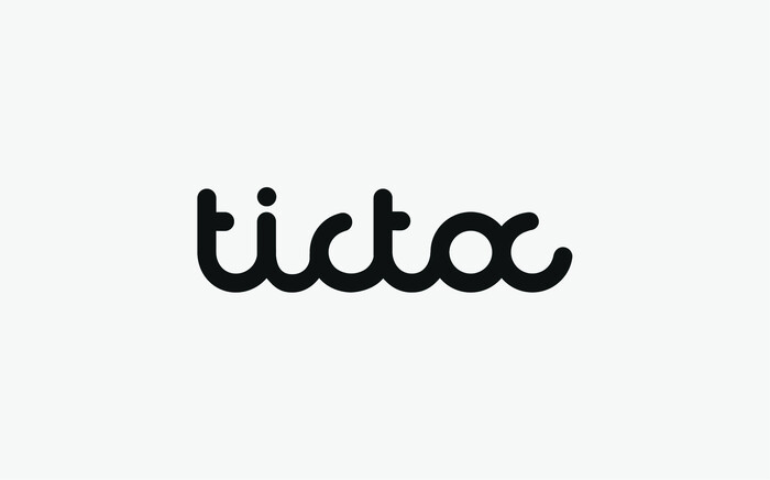
Version 2
A slight modification was made to our initial logo in 2005, which made it appear visually softer.
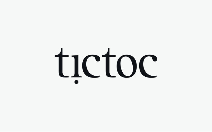
Version 3
A refresh in 2010 brought a more 'grown-up' serif look and feel. But still a clear evolution.
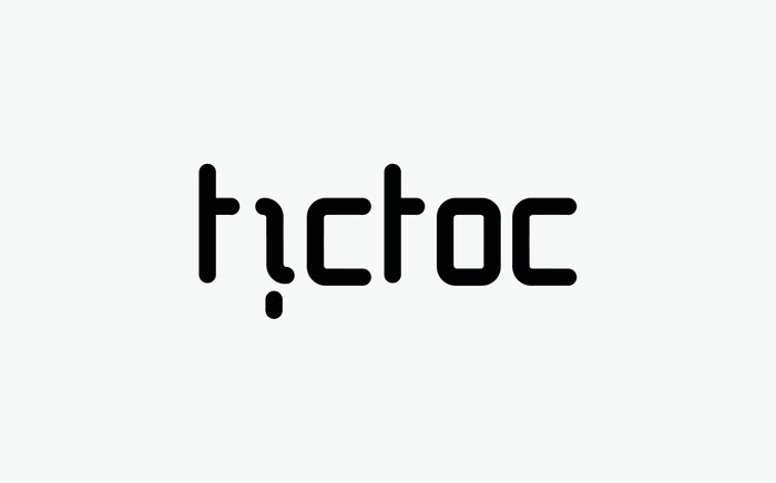
Version 4
And then the big change in look in feel in 2014.
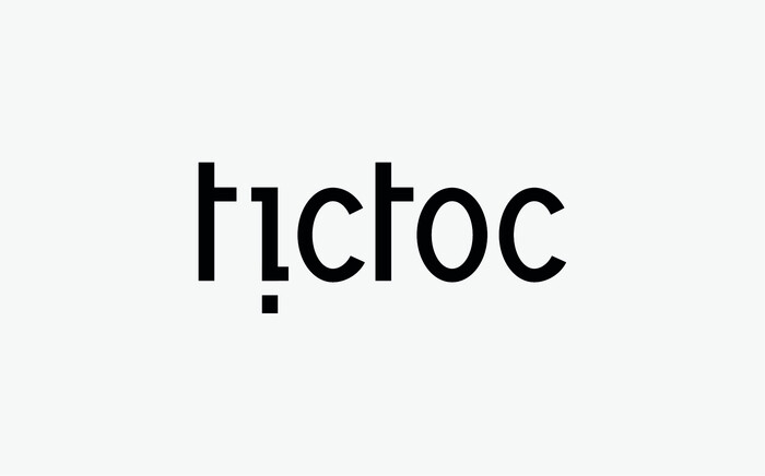
Version 5
And now in 2023, our evolution of version 4, a minor tweak and a new jaunty angle (15 degrees to be precise).
![]() 24 years… where has the time gone :)
24 years… where has the time gone :)