Web Design for Higher Education in 2017
At tictoc we’re no strangers to web design for higher education. We helped Morley College London to improve the user journey for their students, and we’re currently helping Glasgow Clyde College to streamline their course search and surrounding website.
Getting a potential student from ‘I want to study something’ to applying for a course at your institution is a complex task. Here are some tips from our design team that help make the journey as smooth as possible.
Create effective wayfinding
Visitors are coming to your site in search of something – they’re employing their hunter-gatherer instincts to find specific information. The quicker they find what they’re looking for, the happier they’ll be, and as a result they’ll be in a better frame of mind to complete the journey: you share that common goal.
How do you make sure that everyone finds their way to the course(s) they’re looking for? Give them as sophisticated tools as you can, but make sure they’re appropriate for the task. To do this, run through as many of your users’ goals as you can think of. These goals could include:
- ‘I want to do a creative course in the evenings but I don’t know what yet’
- ‘I want to study landscape photography’
- ‘I’ve studied calligraphy already and I want to progress to the next level’
- ‘I want to choose the life drawing class that suits me best’
Once you’ve completed this list, it’ll help inform how you choose the filters you give to visitors: the tools that they can use to find their way.
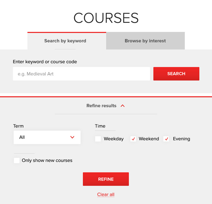
These are the search and filter options we finalised for Morley College. Yours may be different, and will depend on your content and your users’ goals.
Give off the right information scent
Potential students will have at least a good general idea what it is they’re hunting, but they’ll need a scent to follow. By giving the right snippets of information at the right times, you’ll help to nudge people in the direction of their goal.
Ensure that the call to action to start the search is as prominent as possible. You can pick the section out in the main menu, or have a huge call to action on popular landing pages, just make it really obvious where to start.
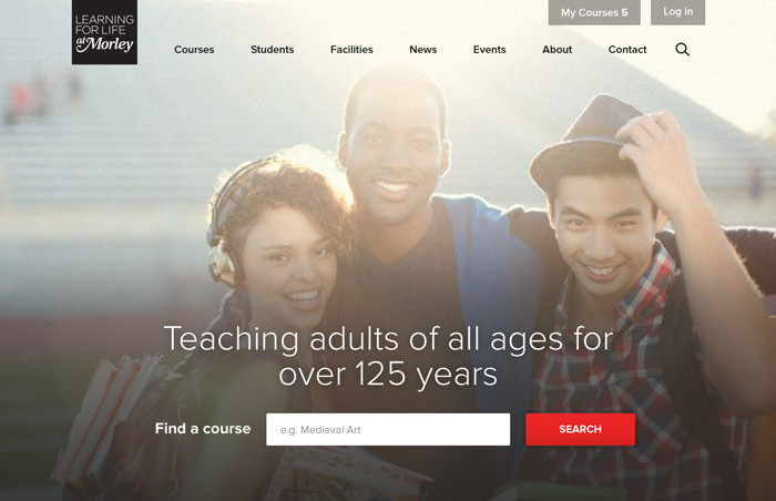
On the Morley College website, the first item in the navigation is Courses, and the course search is brought front and centre on the homepage.
Choices should be easy to skim
Give your visitors only the key information along the way. Too much detail at this stage will hamper skimming, and slow down the process. What, where and when are good starting points for information to list on each course. These help users to quickly check against their personal criteria. Another good one is how often. Keep these simple – you can provide more detail when it’s appropriate.
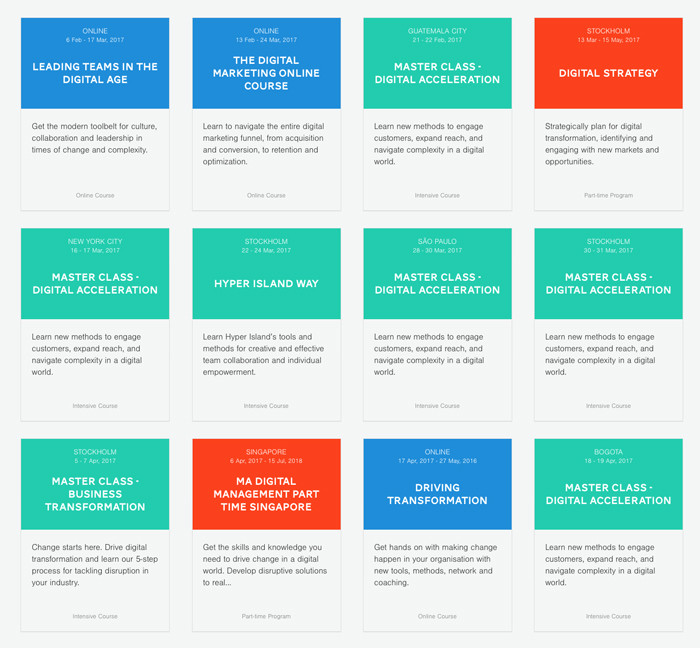
The oft-lauded Hyper Island website displays succinct course listings with just the right information on them. Furthermore, items are colour coded to speed up skimming.
Make the offer impossible to refuse
The deliciousness of the quarry is just as important as the delight of a smooth journey. Once your users have found what they want, they’ll slow down the pace and take a good, long look at the course you’re offering.
Go into plenty of detail
Different people will be looking for a huge range of very specific information. You don’t want to risk someone not finding the information they’re looking for and having to find someone to contact (or worse, go elsewhere) so provide as much as you can. Take a deep dive into:
- Learning outcomes
- Career paths
- Entry requirements
- Application process
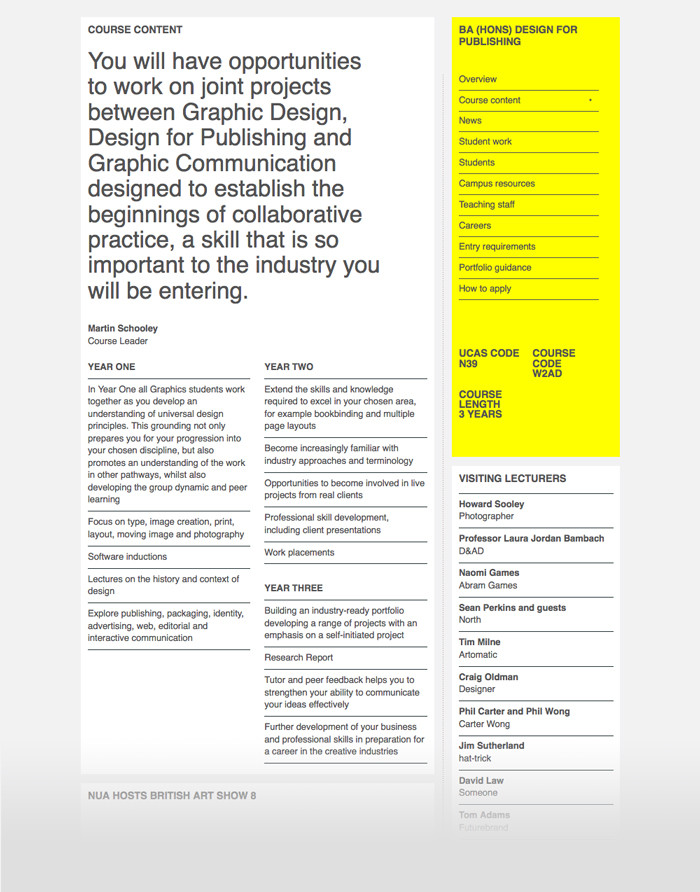
The course detail page on Norwich University of the Arts goes into lots of depth showing the syllabus, careers, portfolio guidance, and even visiting lecturers.
Break it down
Information should be clearly separated and easy to find when scanning through the page. Break the information up into clear sections so that users aren’t just faced with a wall of impenetrable text.
Start with the most important information as a quick summary, then have clearly headed, medium-length sections to describe the specifics of what you’re offering.
It helps to keep this information consistent. Consider providing each department with guidelines, or restricting the content to a set of uniform sections that all courses conform to. This will provide a consistent experience across the site, and allow potential students to compare courses more easily.
Make it tantalising
While it’s vital to include all of the details of what a course offers, it would be a bit dry and not hugely tempting without some extra juicy elements. This is a great place to include social proof to show visitors that your course is what they’re looking for. Social proof – such as testimonials, photos, student interview videos, and success stories – helps to convince people of the value of the service you’re offering because they can see the value it has given to others.
California-based Art Center have multiple modules with testimonials, photo galleries and the like to accompany the technical information of their courses.
You can intersperse this within the other information, or keep it towards the end of the page. It’ll provide important extra incentives for visitors to take the plunge and become a student at your institution.
Don’t drop the ball
Once someone has made the decision to apply for one of your courses, make sure to make that as painless a process as possible. Make sure that the call to action is so obvious that it would be hard to miss.
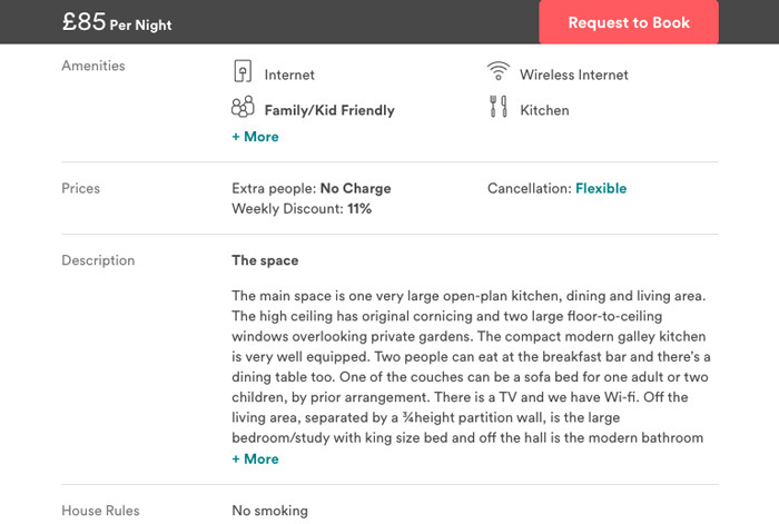
The call to action on an Airbnb detail page is highlighted in a prominent brand colour, and sticks to the top of the page as you scroll so it’s always within reach no matter where you are. This is a useful pattern to implement on your course detail page, which will have a similar depth of information.
You just boosted your web design for Higher Education skills – good job!
If you follow this design advice, you’re well on the way to a smoother, happier journey for visitors to your higher education website. We have used effective wayfinding combined with careful content hierarchy to great effect with the Morley College website, and Glasgow Clyde College has remarked repeatedly that their students are going to love us for all of the improvements we’re bringing to their user journey.
We hope you have as much success, and please don’t hesitate to get in touch if you have any questions about web design for Higher Education.