5 psychological tactics to improve charity landing pages
A well-designed donation landing page can make a significant difference in the number of contributions your charity receives.
But what is it that inspires us to donate to one charity over another? Behavioural science reveals that our actions are frequently driven by emotion rather than logic, and that the actions of others influence us. In this article, we unpack five psychological techniques charities can use to create more effective landing pages.
1. Utilise social proof
Social proof is the concept that the actions of others influence us when deciding how to think or act. When we see others ‘endorsing’ something, we attach value and trust to their choice, and are more likely to copy them. So for charitable donations, seeing others give to charity makes us more likely to give.
One way to use social proof is by displaying real-time donation figures or showing the number of supporters who have contributed. You can also highlight corporate partnerships, well-known donors, or any awards your charity has received.
Another effective approach is to feature user-generated content. If people have shared their donations or fundraising efforts on social media, consider embedding these posts on your landing page.
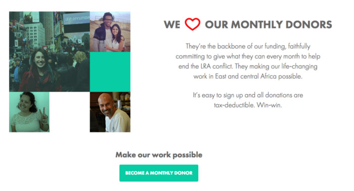
The donation page for the charity Invisible Children utilises social proof by featuring photos of genuine donors. In doing so, the charity is not only appealing to potential donors to donate based on the actions of others, but also rewarding those who have signed up by featuring their images on the landing page in return for their commitment.
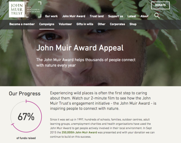
If you are fundraising around a specific goal, you can also make use of progress bars to communicate how close the charity is to its fundraising target. When tictoc designed landing pages for the John Muir Trust and its campaigns, we used this technique to help encourage users to donate, as seen in the example below.
2. Make use of celebrity endorsements
Celebrity endorsements might not be a new marketing concept, but that doesn’t diminish their effectiveness. A well-placed endorsement can increase trust and visibility for your organisation.
There are several ways to use celebrity endorsements. A simple quote or image from them explaining why they support your cause can be effective. If they have recorded a video, even better - video content can engage visitors more effectively than text alone. But it’s important that the endorsement feels genuine. If a celebrity has a strong connection to your cause, make that clear. People can tell when endorsements are inauthentic.
Charity Water’s ‘birthdays’ campaign landing page provides an excellent example of celebrity endorsement in action.
The landing page tells the story of how and why people should pledge, then solidifies the message by showcasing celebrities who have also pledged.
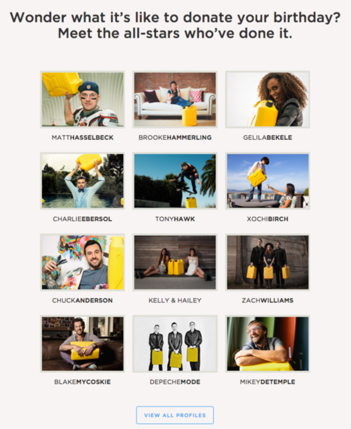
Why do campaigns like this work so effectively? Psychology studies have shown that celebrity endorsements can “magnify the effect of a campaign”, trigger emotional responses and even improve our ability to remember marketing messages.
3. Show testimonials from service users
As a charity, your biggest advocates can be those who have already benefited from your work. People want to know their donation will have a real impact, and the best way to show this is through testimonials.
When designing landing pages for the UK charity Connect, it was important for tictoc to illustrate the positive impact the organisation has had upon its beneficiaries.

While research has found that marketing emphasising the proven effectiveness of an organisation doesn’t actually increase donations, testimonials can make your charity more personal and relatable. Include stories or videos from individuals who have received help. Where possible, use real names and photographs to add credibility.
4. Use directional cues to guide users
It’s important to remember that people don’t read websites the way they read books. When we view a web page, we navigate towards visual cues such as arrows, contrasting elements or the eye-direction of a photographic subject.
Use directional cues to guide users through your landing, towards the desired outcome/donate button.
War Child uses directional cues throughout their site, and even homepage to orient users towards the donate section of the site.

As well as using more obvious visual cues like arrows, War Child also uses photographs in which the subject is looking directly at the camera. When you couple this technique with persuasive copy such as “we need you”, it has the powerful effect of appealing directly to the user.
5. Choose appropriate colours
Colour plays two incredibly important roles in landing page design. First, colours establish contrast between page elements and help with readability. And second, colours are often associated with emotional or psychological responses.
The following example from Oxfam’s donation landing page highlights these two principles in action.
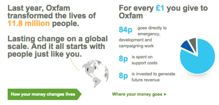
Colour contrast enables key information to stand out so that users can gain a quick understanding of the impact of the work.
The colours used also help communicate the importance of the work in a more subtle way. It's no surprise that they use blue for factual information, as blue is often associated with trustworthiness, sincerity and loyalty.
Oxfam uses green as a core brand color; however, in this case, it also cements the user's understanding of how the money will be used. This is likely to be a deliberate move, as green is associated with financial themes and stability. Finally, the colour orange is an active colour, suggesting energy and progress.
Key takeaways
As we’ve covered in this article, there are many psychological tactics that you can use to design effective charity landing pages. Tactics like social proof enable us to tap into the influence of others, be it our friends or even the goodwill of celebrity ambassadors, whilst subtle design features can help orient users towards specific goals.
When designing websites for our charity clients, we always employ the most appropriate tactics to help our clients achieve their targets. If you'd like to find out how tictoc can help your charity, please get in touch.