What Makes Good Web Typography?
The days of rendering text as images, relying heavily on javascript or flash to render non-standard fonts on websites are long gone. Since the introduction of web fonts in the late 2000’s, designers have fully embraced the web platform as a place that great typography can now be enjoyed.
Typography is one of the most important aspects of a website's look and feel, however, when we look at web pages the typography shouldn’t necessarily be the first thing that stands out, especially if its applied well. It should really be enhancing the user experience, making it easy for users to navigate around and find the information they are looking for, and accomplish their goals - all whilst being accessible across the growing number of devices people are using to view websites.
Type well used is invisible as type, just as the perfect talking voice is the unnoticed vehicle for the transmission of words, ideas.
– Beatrice Warde , American writer and Typographer
Its important for websites to be readable, and by this, I mean that users should be able to easily read pages, even long-form text, and absorb the information provided leading to a positive user experience. This is done by carefully considering various key aspects when starting to design web pages.
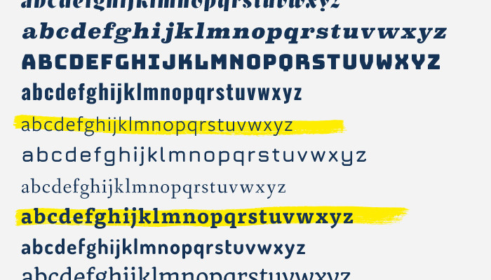
Choosing the right font
To start with, it's important to choose fonts that don't distract the user from the content. Users should be able to read and scan the web page easily. There are plenty of really good web fonts available from type foundries and online subscription services. Google also has a wide selection of web fonts which are free to use. It’s quite easy to get carried away with all the web fonts available and to use a whole bunch of fonts within a website design. Keeping your site to around two fonts which compliment each other usually works best.
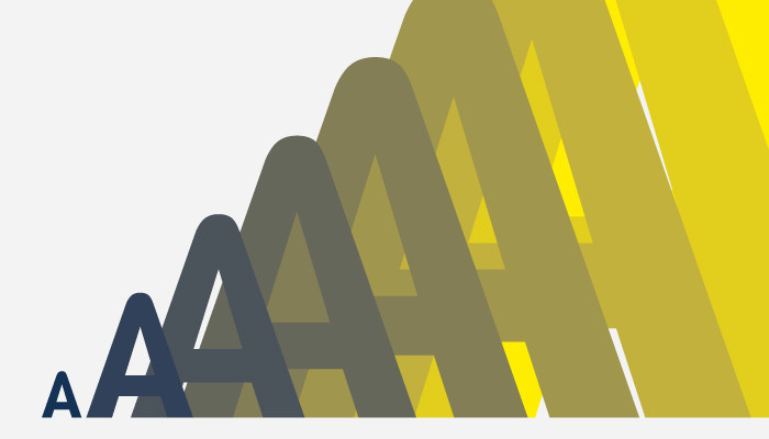
Size matters
Having a good balance between the size of the headers and the body text along with positioning and spacing helps to shape the content hierarchy and leads users through the content, making the page easily scannable for key information. Headers should be consistent throughout the site, not just in size but also colour, providing users with a familiarity and help keep the content organised.
For body text, a comfortable reading font size is required - this is usually around 16-18px. However, some fonts may allow you to set them a little smaller, or indeed, a little bigger for legibility. Like headers, body text should also be kept consistent in size throughout the website.
What works on a desktop won't necessarily work on mobile phones. Having to zoom in to read a web page on a mobile phone, just like using images as text, should be a thing of the past. With responsive web design, headers and body text sizes should be adjusted across the various different viewports delivering content clearly.
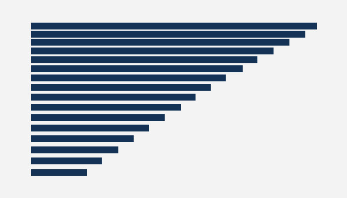
Length matters too
Whilst setting the font sizes, the measure, also known as the line length, should also be taken into consideration. It's usually recommended that the measure should be approximately 45-75 characters per line - including punctuation and spaces.
If a line of text is too long the user's eyes will usually find it difficult to focus on the text. This is because the line length makes it difficult to gauge where the line starts and ends. In larger blocks of text, it can be difficult to continue onto the correct line.
If a line is too narrow then the eye will have to work harder travelling back too often. This can lead to users skipping important words if lines are too short, making them begin on the next line before they have finished the current one. However, on mobiles, the font size should take priority over the number of characters per line, which should be around the 30-40 characters mark.
Typography is an art. Good typograpy is art.
– Paul Rand, Art Director and Graphic Designer
It's all looking a bit dense
The line-height, also known as leading, shouldn't be so tight that it's difficult for the user to finish one line and start the next. Neither should it be too loose, that lines are too far apart making the user's eye travel longer between lines. Making sure there is a balance between line-height, letter-spacing and font size should help users read the content better.
Within the overall page design, content needs space breathe so adding some whitespace will help to break up the content into more manageable chunks and allow users eyes time to relax.
To the left, to the left!
In Latin-based languages, we read left to right with text mostly being left-aligned and ragged on the right. This allows our eyes when reading a large quantity of text, to easily judge the distance from the end of one line to the start of the next.
Text which is centre-aligned should be used sparingly for items that run over only two or three lines at most. This is because unlike left-aligned text, there are no common points where lines begin and end.
Justified text, text that aligns both left and right, can also cause problems for readability, as there is less of a visual cue to where a line finishes. Adding to this, spaces between words will vary slowing down the reading time.
Type and Colour
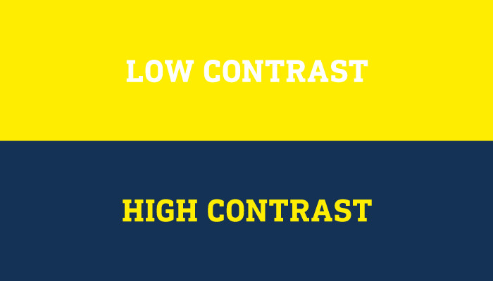
Colour can really help to pull out information on a web page, but like fonts, the number of colours used should be kept to a minimum as the more colours there are, the busier the web page will tend to look.
For readability, as well as accessibility, a good contrast is required between the text and backgrounds. This makes the text easier on the user's eye and allows users to read and scan pages more efficiently. If the contrast is too low, then users will generally find it much harder to read - usually resulting in the user leaving the website to find what they're after elsewhere.
Clickable areas of text are also clarified by a particular colour. Again, this should be consistent throughout the site so users know what is clickable and what is not. As per the importance of colour in web design, colour plays a huge role in accessibility. With 8% of men and 0.5% of women affected by some form of colour blindness, a lot of thought is required when selecting colours as not to exclude impaired or disabled users.
What makes good web typography?
When it comes to web typography, everyone has their own perspective on what works best. When working with brands, it's about ensuring the typography used is consistent with that used elsewhere within their identity i.e print and marketing collateral, packaging, exhibition materials, etc. However, small sacrifices might need to be made such as replacing a font for something similar to ensure readability for the website users.