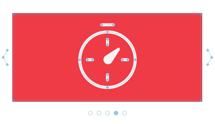
Carousels Are Bad News
In the past, carousels were the ‘in thing’. Pretty much every website you visited had one on its homepage. They were mainly located in that prime position, just under the navigation, so that every user would see your latest products, services or the latest news. For large organisations, carousels were the answer to all their problems, as it allowed lots of information to be displayed in one place whilst keeping all the different departments happy.
So why are we seeing more websites removing carousels, or new websites being built without them? Well, this is mainly due to user-interface designers understanding the ever-evolving browsing habits of users, based on how they now interact with websites on both mobile phones and tablet devices.
Scrolling comes naturally
It was once the view of many designers and clients, that important content within a web page should be kept 'above the fold' i.e. the portion of the page that is visible without scrolling. However, with more users now browsing the internet on mobile phones and tablet devices than computers and laptops, users have become quite accustomed to scrolling. This means that content which was once required to be shown 'above the fold' can now be shown further down the page where not only is it more prominent but it also doesn't disappear to show something else every 5 seconds.

Fun fact: On mobile phones over half of the users start scrolling within 10 seconds and 90% within 14 seconds. - Luke Wroblewski - Tweet
Users are usually in a rush
Users are busy people and are usually just want to find what they are after and move on. On average users will spend 10-20 seconds on a page so it's highly unlikely they'll hang around to view every banner within the carousel resulting in an extremely low click-through rate (CTR).
How many banners?
‘Banner blindness' is another common issue. With the popularity of carousels, and their ability to contain so many banners, users have just become blind to them and usually end up completely ignoring them. This means these important pieces of information just get missed completely.
Where is the navigation?
Most multi-bannered carousels use either dots, numbers or arrows to allow them to navigate left or right through the banners. These can be so subtle that users completely miss them. Some carousels only show the navigation when hovering over them, whilst some don’t even offer a navigation to the user.
On mobile, it is pretty much the same issue with the addition that sometimes carousels don't allow users to swipe through the banners left or right.
Auto-rotating carousels
Auto-rotating carousels have two big drawbacks:
- Too fast - Users would land on a website homepage and instantly be faced with a carousel banner which takes up a large proportion of the viewable page. They would start reading, and be halfway through when it automatically jumps to the next banner after only a few seconds.
- Too slow - Users would finish reading and then wait patiently for the next banner. Only, by the time it did change they had already scrolled down the page or clicked away before actually seeing what the next banner had to say.
Fun fact: Data analytics provider, Chartbeat, analysed data from over 2 billion visits and found that 66% of attention on a normal media page is spent below the fold. - Time.com
Then there are the accessibility issues
It is highly likely that a portion of any users visiting a website will have some form of disability. This should be considered when deciding to implement any new functionality to your website, not just a carousel, as it has many implications for these users.
Carousels which auto-rotate, ie the content disappears after just a few seconds, can cause a loss of focus for users with screen readers or have keyboard focus on that content. This, in turn, forces the user's attention back to the top of the page. Users with motor skill issues are also affected because they may be unable to click on the information fast enough.
Auto-rotating carousels can also be really distracting to users who are trying to read content within the page but can see the banners animate. With users who have cognitive and learning disabilities, it is an even greater distraction and usually causes them cognitive overload.
If a user is visually impaired and can’t see the site content, they can't control it as there isn’t a way to associate controls, neither semantically or programmatically, with the carousel content. It's also often the case that most of the text within the carousel isn’t appropriate for the image alt text.
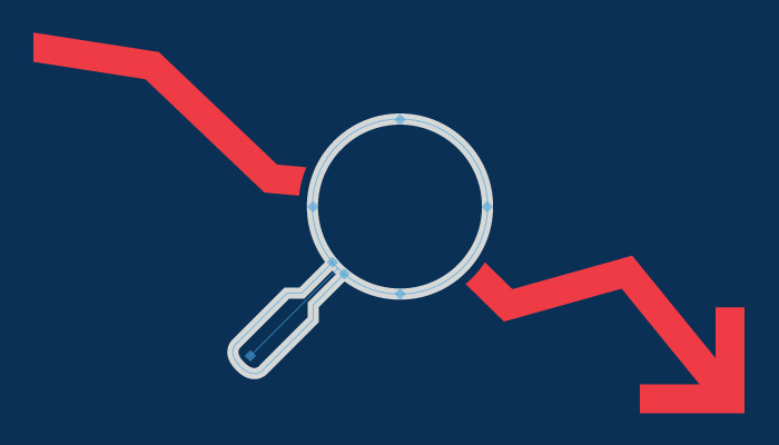
What about SEO impact?
Carousels can have a negative impact on a website's SEO.
- For starters, they can slow down the site's speed depending on how many banners it contains and file size along with the additional scripting required to run the carousel.
- A basic SEO rule is that a page shouldn't contain more than one H1 title tag. However, depending on how, or who added the carousel to your site, it may well contain multiple H1 tags which are really bad for SEO.
- More often than not the textual elements contained with the banners are part of the image. This means that search engines can't read any of the content the banner contains.
So what are the alternatives to carousels?
There are a number of ways to get around using a carousel on your website and improve not just the user experience but also SEO.
Using a hero image
Using a strong hero image is much less distracting to users and allows them to really focus on the content. If messaging is required to accompany the image, then instead of adding text directly to the image, resulting in no SEO impact at all, the text should be added to sit beside or on top of the image via the website content management system (CMS).
A different image on page refresh
In addition to the hero image, each time the page is refreshed, a different hero image could randomly load.
Integrate content into featured areas
Thinking about the content that would go into a banner could be placed elsewhere on the site where it makes more sense within the user journey. For example, if it was to highlight a new event, then maybe a featured event on your homepage or events listing page would work better. Likewise if its a new product or service. If the information you are wanting to add is more informative ie opening times, then this could sit near existing similar information.
Further reading:
UX Myths - Myth #3 People don't scroll
Chat with a member of our team about your online presence - Get in touch!