Some Web Design Trends for 2020
Our industry is always changing and growing rapidly influencing new design trends every year. While there are so many to choose from, we’ve picked our favourites to share with you.
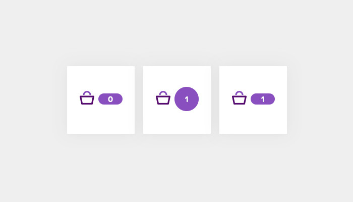
Micro-interactions
What are micro-interactions? Well, you’ve probably experienced them on a daily basis on most websites and apps you use. Put very simply, micro-interactions are tiny, yet very satisfying, movements that website elements make when a user interacts with them. For example, adding an item to a shopping basket or clicking to open a menu.
Their purpose is to engage the user and provide them with quick feedback about an action they have taken. Micro-interactions have been increasingly used in web design over the past few years and we expect to see plenty more this year. At tictoc, we look to add micro-interactions to all of our new sites to improve the overall user experience.
Asymmetrical Layouts
Asymmetrical layouts are becoming ever more popular in sites and are a nice break away from the feel of “templated” design. Of course, an asymmetrical design doesn’t suit every site and brand and it very much depends on the type of content being displayed. Creating an asymmetrical layout however is not an easy task and attention needs to be paid to how elements align to the grid across all different screen sizes, from the smallest to the largest.
While asymmetrical designs can be challenging, when they are done correctly they can be aesthetically pleasing and can help to convey a sense of movement throughout the site. The key is knowing where and when an asymmetrical design will work! We are currently working on several sites with asymmetrical layouts for pages that lend themselves to telling a story, which leads me on nicely to our next trend.
Storytelling
This has long been important in user experience and something we always encourage our clients to do. Done properly, it should help the user empathise with your brand. It makes pages feel more engaging and encourages the user to keep reading to find out more, especially if beautiful imagery is mixed with spot-on copywriting and perhaps some animation or micro-interaction to finish it all off.
Stories are great for landing pages promoting new products, to talk about the history of your company, or explain what it is that you do. Remember to end on a call to action or some related content allowing the user to continue their journey through your site.
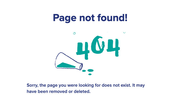
Animated illustrations
We always enjoy being able to animate elements on a site when a client comes to us with illustrations or icons that lend themselves to this. Recently, we’ve experimented with animating 404 pages. Sutton High’s 404 page has bubbles rising from a beaker and Scottish Renewables has wind turbines spinning round. We plan to do much more of this in the coming year including animation for some tictoc promotional projects, watch this space!
Ultra minimal navigation
This is when the pages in a site are hidden behind a menu button instead of being displayed as main navigation on larger screens. While this can work for very simple sites with few pages and one level of navigation, for most websites (especially large ones!) it would prove frustrating for users. However, it is a trend and many people do ask for it.
Here are some reasons why we wouldn’t suggest it if your site has a lot of content. When people first land on a site, the navigation tends to be one of the first things they see, reading it can give the user a good idea of what your company is about. It allows discoverability of content that may not otherwise be found.
Hiding navigation makes it significantly harder for users to complete their tasks, if you rely on income from an online shop or want users to take part in a fundraising event for you or sign up to volunteer, this is not in your best interests. Hidden navigation on a mobile device makes sense as available screen space is very small. However, when increasing the screen sizes to a large desktop there is no good reason to hide the menu.
Check out our case studies for some more website design inspiration. Keeping your website design fresh can help to improve user experience and navigation of your site.