The Importance of Colour in Web Design
Since early man first learned to use red ochre to graffiti cave walls, colour has been used as a powerful form of communication throughout our history.
Over the years, scientists have continued to study the psychology of colour and its impact. However, simply by observing what surrounds us, you can see the impact colour makes in our world. From the clothes we wear to the trinkets we buy, colours evoke different feelings and emotions that influence our everyday decisions.
Studies suggest that people make a subconscious judgment about a product within 90 seconds of initial viewing. Up to 90% of that assessment is based on colour alone.
Memory retention and recall are also enhanced through colour, which is pretty important when it comes to remembering a specific product or brand - it is why businesses and organisations tend to place so much importance on getting their branding right. They want to stand out from their competitors and use colour to evoke particular emotions from their target audience. This, of course, doesn’t just apply to their logos, adverts and brochures – it also applies to their online digital presence - helping to define their website in a very crowded market.
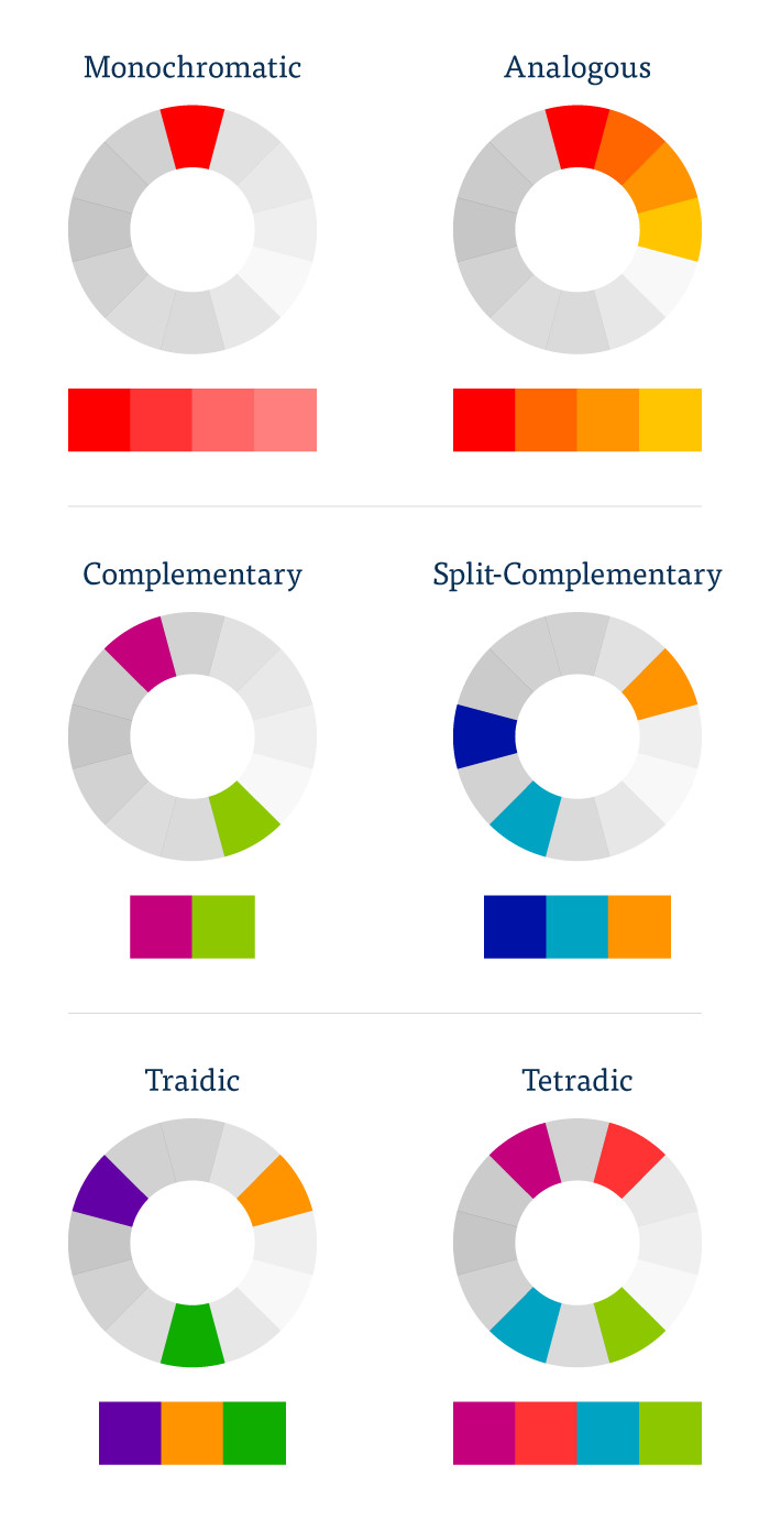
When used correctly, colour - along with good typography, can be one of the single most important aspects of website design - so getting the palette right at the start of the project is essential and should ideally be limited to two or three colours as to not complicate the website design and overwhelm users. The most common colour palettes usually fall into the following categories:
- Monochromatic - when hues, or tints, from a single colour are used.
- Analogous - utilising colours which sit next to each other on the colour wheel.
- Complementary - this is created from two colours opposite each other on the colour wheel. These work really well where a high level of contrast is required.
- Split-complementary - like complementary which uses the opposite colour, this palette uses two opposite colours.
- Triadic - this is created from three colours which are evenly spaced around the colour wheel.
- Tetradic - also known as the rectangle uses four colours. This allows for plenty of variation within the design.
Not only can colour help make a website more memorable and provoke emotional stimulation, it can also make the user experience more enjoyable resulting in higher conversion rates. Along with a well designed user-interface, helping visitors to navigate through the site is one key role colour plays, guiding them through the site content easily and quickly. Colour also helps towards building a content hierarchy, focusing attention on key information and calls to action.
The proof is in the pudding. Take the software giant, HubSpot, as an example. A while ago, they publicly shared their results of an A/B test they carried out looking explicitly at the impact of colour theory and the relationship to conversions.
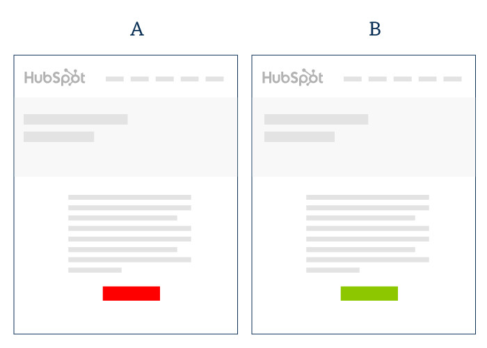
They had two pages which were identical apart from the call to action button - one had a green button whilst the other had a red button. Over the days that Hubspot ran the experiment, they had over 2,000 visits to the page. The result? The green button attracted 21% more clicks than the red.
Colour in Web Design - What About Accessibility?
Accessibility is where colour plays a very important role. With approximately 8% of men and 0.5% of women affected by some form of colour blindness, using colours with a high value of contrast is key in making sure visitors can read content - especially where text placed on coloured backgrounds are concerned.
The reason Facebook uses blue for its main brand colour isn’t that it was the founder, Mark Zuckerberg, favourite colour. He’s actually red-green colour blind which means blue is the colour he sees best. It also so happens that red-green blindness is the most common form of colour blindness there is - which comes in handy when you have over 1.94 billion monthly active users.
Putting colour to good use
Here is a selection of sites tictoc have designed over last few years which utilise the above colour theories whilst maintaining a standard of accessibility from mobile to desktop.
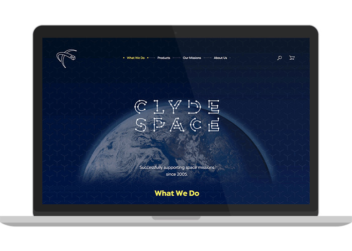 The Clyde Space website uses a complementary colour palette. The yellow content and graphics #f8eb60 on the dark blue background #012169 creates a very high in contrast allowing content to be easily read as well as highlighting on page actions and link/button interactions.
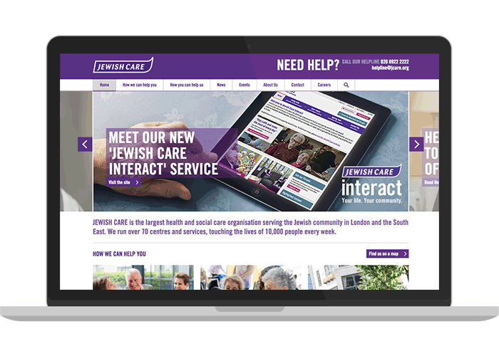 The Jewish Care website uses a monochromatic colour scheme for its base palette. Different hues of the purple #592c82 are used to create contrast within the content, which in turn, creates a hierarchy and pulls out key information and actions.
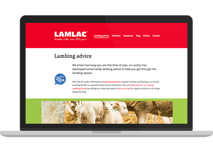 Based on their brand guidelines, the Lamlac website uses a triadic colour palette of Red #ee0024, Blue #3078b7 and Green #9dc747. Utilising white and black as part of a supporting palette allows content to have the high contrast required for information and actions to be visually accessible.
The Importance of Colour in Web Design
Working with colour can be very complex as there are many variables to take into account when designing websites. However, having a solid colour palette to work with is a great first step. The importance of colour in web design is clear: when used creatively, whilst taking into account the needs of the target audience and the site content, it can really make a difference to the user experience and ultimately the conversion rate.